Five Fashion-Forward Fall Color Palettes: Autumn Wedding Inspiration

Even the most common Autumn
day is a revelation. To simply wake to a window full of autumn’s colors; to walk at dusk, what could be more dazzling? The splendor of God’s creation is on full display in each jeweled fruit and clinging leaf. Pomegranates, like so many scattered rubies. Bosc pears, champagne in color and taste. Maple leaves, precise as little fallen stars. Light that touches the tip of a yellow tree: a moment of perfect luminosity. A bitter, beautiful morning coffee, and a rush of bracing, cold air.
It is the kind of beauty that hurts, for it is just on the brink of leaving us. Into autumn we read the signs of our own mortality, and that of our loved ones. We know winter is closing in. Our hearts hurt from the upheaval of loving something that will leave us. And yet—autumn’s heights are so thrilling. As I write this, Mahler’s No. 5 plays, and it feels like the season, like its exquisite ache—autumn in a song. How the music swells, how glorious it all becomes, moments before the ultimate surrender to silence.
Nearly every autumn, it seems that I am given one glorious moment in nature. These autumn moments are simple, and yet so profound, the event writes itself into my poetic memory. I remember a morning following a night of fitful sleep; I stood on my porch, ruminating, only to find my thoughts (blessedly) interrupted by a soft music-- leaves as they simply fell. It was something I confess I had never stopped to listen to before; that music was to me, that morning, as sweet as any angel’s song.
This autumn, I was moved by the reflection of russet and yellow trees on the water’s surface. I’m not sure if I have ever seen beauty mirrored like that. Soon after, as I walk across a bridge, I was at once arrested by a river scene. The view was mostly shaded, but as the eye followed the river’s path, it reached a point flooded in light, where golden foliage graced the river’s edge. How satisfying was this contrast of light and shade, like walking through a dark, tangled forest into a sun-drenched, open field. The balance of movement and stillness-- the flow of the river, set alongside the stillness and mass of a maple tree—satisfied and soothed the mind. Just before I turned away, a bird flitted from a river rock and took flight, disappearing into the light-filled expanse. I recalled how Wordsworth could make a poem of leaves dancing in a rainstorm. I understand how the simplest moments in nature can become, in the artist’s hands, pure poetry (how they are so, even before the artist touches them).
While the beauty of autumn cannot be perfected upon to any degree—who could improve upon the artistry of our Creator?—I find myself drawn to designs that interpret the mood and atmosphere of the season in unexpected ways.
“the most beautiful things tend to have an unanticipated quality."
The most successful autumn designs (to my eye) carry something of the sense of surprise felt in those nature scenes. A moment of beauty, a glimmer of glory, that comes to one, unbidden. I feel that the most beautiful things tend to have this disarming, unanticipated quality; God’s most gracious gifts are often unlooked for, unexpected. They interrupt us out of our everyday routines, our slumber, our doldrums—they come to us when we perhaps feel least prepared to respond to beauty. Isn’t this the essence of a gift, of something undeserved? Such moments refresh the heart and give it “life and food /For future years” (Wordsworth, “Tintern Abbey”).
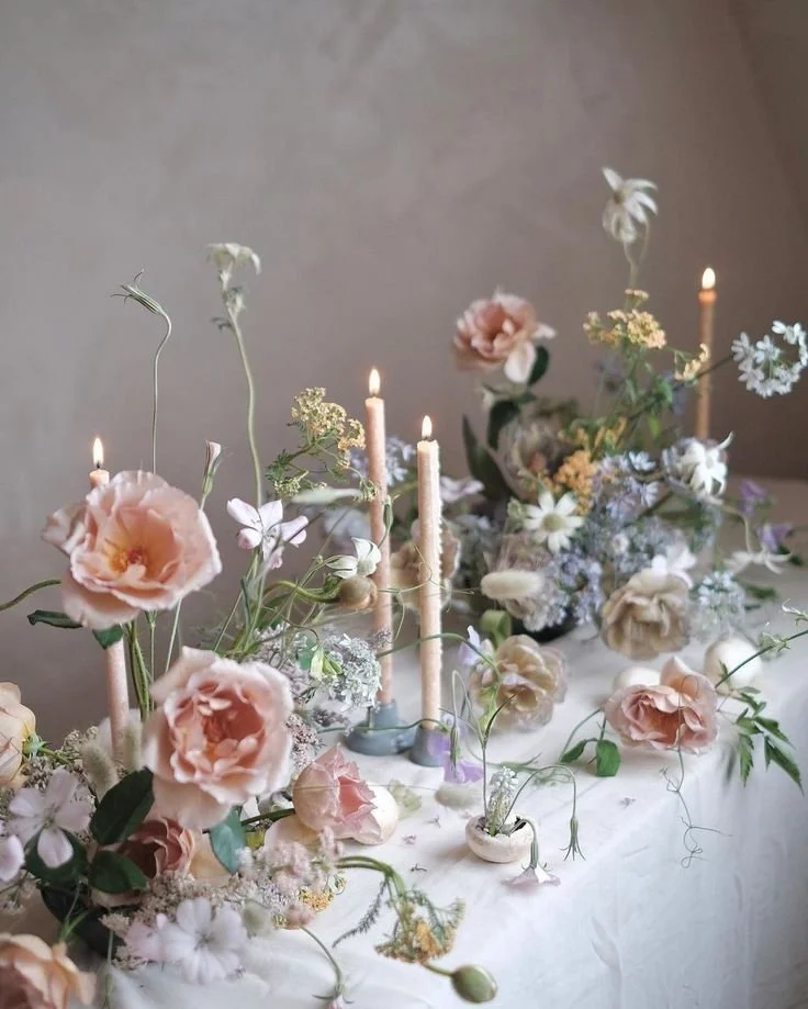
Of course, I greatly admire season floral arrangements and food: art that displays perfect fidelity to the seasons and allows the recipient to dwell fully in the present moment. But I also love creative things that aren’t literal, on the nose. Especially when it comes to wedding design, I appreciate an artistic take on autumn’s color palette. Such colors evoke an autumn mood or atmosphere without necessarily being, you know, pumpkin spice colored. Seasonal yet surprising, these palettes allow us to see autumn in a new light.
Read on for five ravishing color palettes. They are my ode to the season—a fashion-forward but hopefully faithful to autumn’s essence, its charms. Use them as you like, for inspiration for wedding florals, fashion, table designs, cake artistry, and so much more.
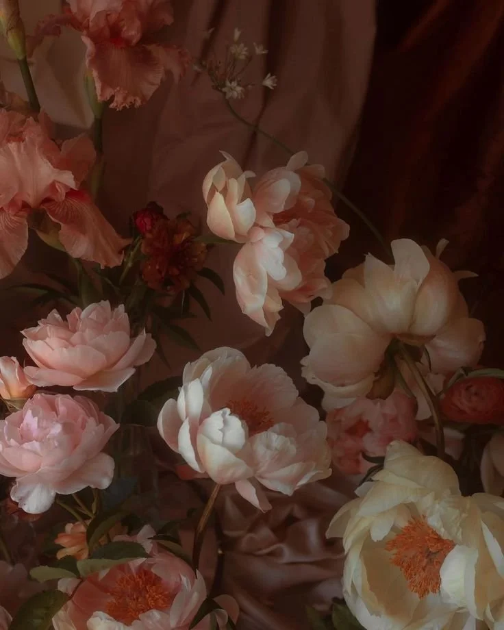
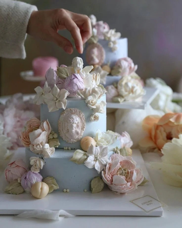
Buttercream & Mocha

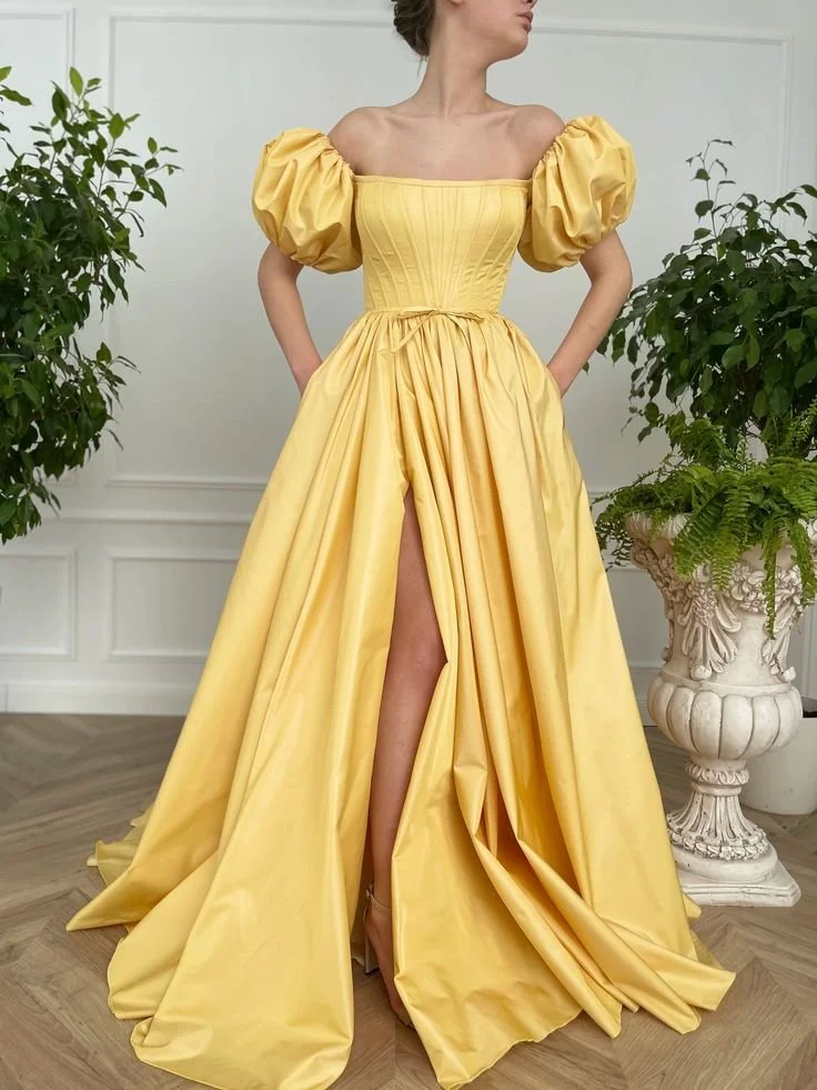
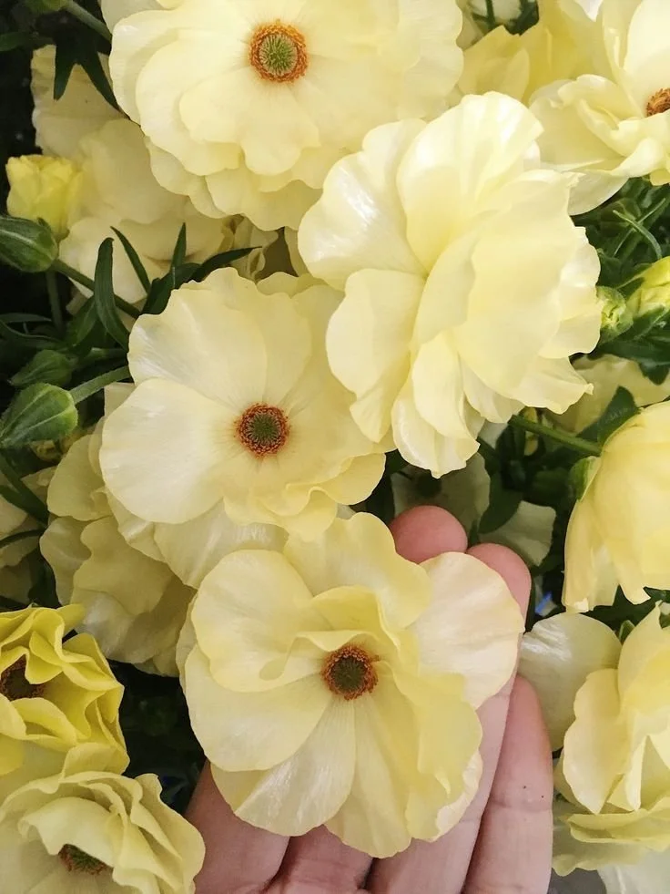
Imagine a pastel yellow cake adorned with buttercream bows, frosting garlands, and delicate rosettes. Such a cake would look like a girlhood dream, a vision from her someday-wedding. Bouquets of butter yellow roses would fill her dream chapel, and maids would process down the aisle in pastel yellow gowns. Even the candles at the altar would be a champagne yellow. For the wedding exit and honeymoon flight, she would opt for an elegant, nostalgic suit—butter yellow with bracelet sleeves, a matching hat, and ivory gloves.


Photos, top left to bottom right: First Row: The Blue Carrot, Amy Howard Home, Silk & Willow, Teuta Matoshi; Second Row: Oscar de la Renta, Choice Farms shared by Delish, Contelier Flower, Third Row: Teuta Matoshi, Simple and Refined, Miu Miu, Shona Joy; Fourth Row: The Farm Dream, The Blue Carrot, Alaska Peony Cooperative arranged by Sweet Root Village, La Musa de las Flores; Fifth Row: Simple and Refined, Behr, Simple and Refined, Contelier Flower; Sixth Row: Silk and Willow, Contelier Flower, Amy Howard Home, Contelier Flower; Seventh Row: Google images, Simple and Refined, La Musa de las Flores, Fleuropean.
While many would imagine pastel yellow in the context of spring weddings, the color takes on an unexpected richness when paired with mocha. Imagine pale yellow peonies tied with a mocha ribbon, or a buttery rose bouquet arranged with a hint of chocolate—cosmos flowers, naturally. We are perhaps accustomed to seeing chocolate with jewel tones, so the color looks fresh and fashion-forward when paired with pastels instead. Imagine a pale, yellow gown with a chocolate velvet hair bow. Who knew that buttercream could look so beautifully, perfectly autumnal? Buttercream and mocha are as splendid and surprising a pairing as any I can imagine. Turn to champagne, candlelight, and ivory as blending colors that complement and complete the palette.

2. Lavender & Chocolate

“This palette reminds me of my favorite gelato pairing— one scoop of lavender, one of dark chocolate.”
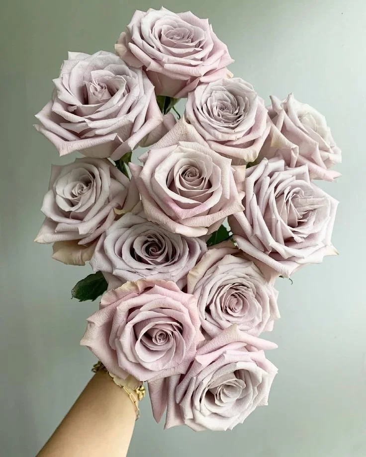
This palette reminds me of my favorite gelato pairing— one scoop of lavender, and one of double dark chocolate. My rules for wedding color palettes, it seems, apply also to desserts. I love the light, fragrant lavender alongside the decadent, darkest chocolate. The contrast is so satisfying, alternating between rich and light bites. And I simply won’t waste my calories on something that isn’t also beautiful; a great part of the pleasure is found in simply admiring the gorgeous colors.
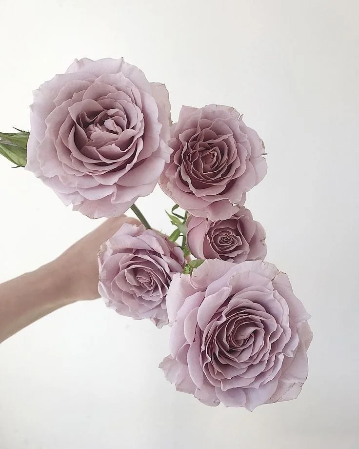
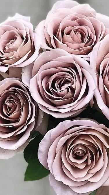
When it comes to wedding styling, flowers alone offer so many gorgeous lavender and lilac shades. Garden and standard roses can be cool, with a touch of frost, or dusky and mauve, with just a tinge of cocoa and blush. For cooler lavender tones, turn to Menta, Amnesia, Lavender Ocean Song, and Earl Gray standard roses. Stainless Steel is perhaps the most exquisite silvery lavender garden rose of all, while Florence Delattre are tiny and charming little rosettes, almost always with three or more clusters to stem, and double petals as frilly and flirtatious as a ruffled petticoat. For complex, dusky mauves that mature into sepia and apricot, opt for Distant Drums and Koko Loco garden roses, and for a pure, classic lavender, look to Love Song.


Photos, from top left to bottom right: First row: Doctor Cooper, Pinterest (image uncredited, source unknown), Flower Moxie, Jenny Packham via Harrod’s; Second Row: Potomac Floral, One Wed, Deviant Art via Pinterest, Call me Cupcake; Third Row: Elie Saab, Silk & Willow, Saint Laurent via Saks Fifth Avenue, Trille Floral; Fourth Row: Whole Blossoms, Jenny Packham via Harrod’s, Contelier Flower, Zimmerman via My Theresa; Fifth Row: Amy Howard Home, Khaite, Grace Rose Farm, Galvan London via Saks Fifth Avenue.
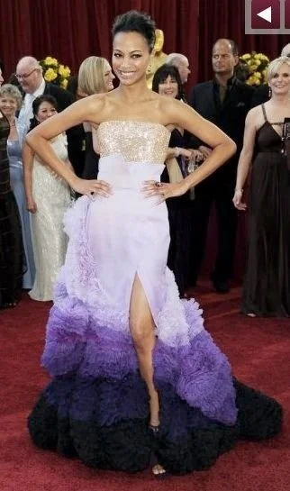
I often look to couture for color palette inspiration, and when it comes to frosted lavender, Zoe Saldana’s Oscar dress, with its frothy tiered skirt, will always be a superlative example. Equally compelling: a Jenny Packham gown in a lavender so bright and uplifting, it needs a new word to describe it. The embellishment on the shoulders gives off an iridescence; lilac and lavender hues, more than any others, beg for a little shimmer. I love to pair them with pearlescent and opalescent whites (read The Frosted Pastel Winter Wedding Inspiration Journal entry for positively luminous inspiration).

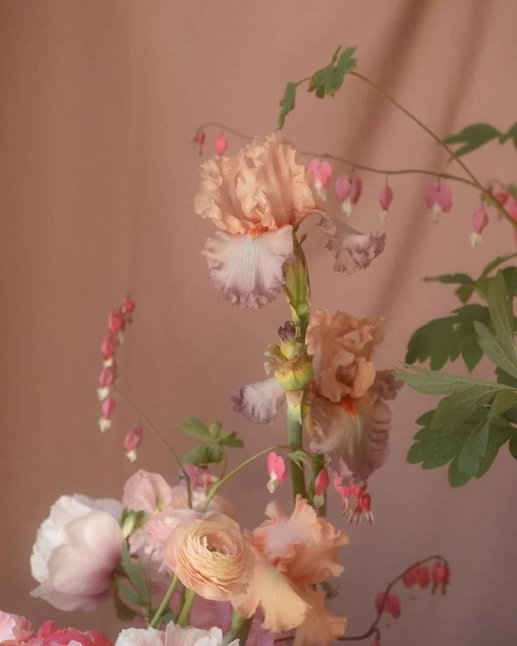
3. Apricot & Blue
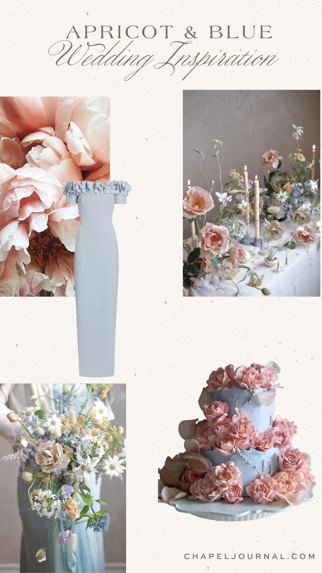
This sophisticated palette reminds me of fine interiors— of Venetian plaster walls; of intricate; and of richly patterned Oushak rugs. A palette like this belongs to the most storied spaces, where fine architecture intersects with high fashion in ways both dazzling and dignified.


Photos, top left to bottom right, First row: Soft Music & Warm Nights, Casa del Colore, Casa del Colore, Casa del Colore, Second Row: Pinterest, Pologeorgis, Silk & Willow, Pologeorgis, Third Row: Brynna Levine | Masks of the Moon, Casa del Colore, Brynna Levine | Masks of the Moon, Casa del Colore, Fourth Row: Contelier Flower, Pinterest, Atelier Soo, Benjamin Moore, Fifth Row: Benjamin Moore, Silk & Willow, Pologeorgis, Cully Avenue, Sixth Row: Pologeorgis, Casa del Colore, Loeffler Randall via Saks Fifth Avenue, Casa del Colore, Seventh Row: Grace Rose Farm, Casa del Colore, Contelier Flower, Casa del Colore, Eighth Row: Benjamin Moore, Casa del Colore, Brynna Levine | Masks of the Moon, Casa del Colore, Ninth Row: Casa del Colore, Casa del Colore, Farrow & Ball, Casa del Colore.
Apricot is perfectly at home in autumn, a color readily found in the season’s fruits, foliages, and golden sunsets. The hue is more feminine than orange or pumpkin, and more unexpected, with its blushing tones. And florals in apricot colors— simply sublime. Tie peach-colored posies with a French blue ribbon: the ultimate autumn accessory, as sophisticated as any fine Autumn/Winter handbag.

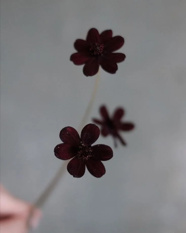
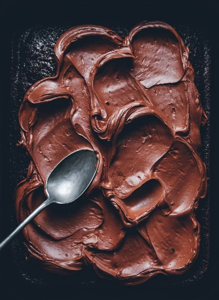
4. Mocha & Merlot
Some of the most exquisite chocolate treats—whether powder-dusted truffles or rich cake batter—have a russet hue to them. For this reason, merlot is a perfect complement, drawing out chocolate’s rich, red tones. A pairing as decadent and satisfying as a glass of fine wine and a square of exquisite tasting chocolate.
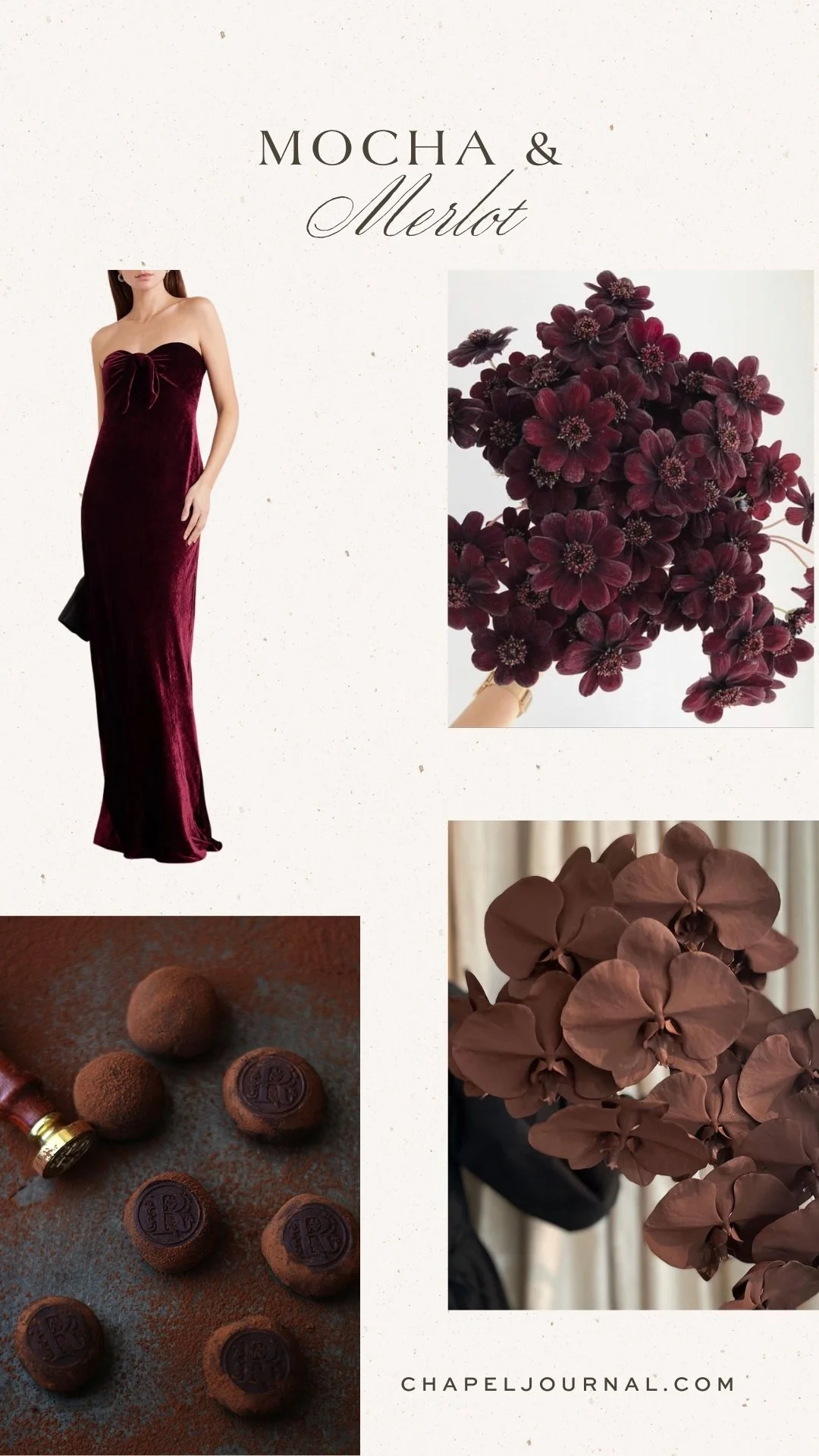


Photos, from top left to bottom right: First Row: Soo Linen, Tremella Botanicals, Yves Solomon, Pinterest, Second Row: Cosmopolitan, Shrimps, Silk & Willow, Shrimps, Third Row: Dôen, Jack Henry for The Lane, Simple and Refined, Silk & Willow, Fourth Row: Jack Henry for The Lane, Birdasaurus, Rose Story Farm, Simple and Refined, Fifth Row: BBC Food, Pinterest, Birdasaurus, Pinterest, Sixth Row: Birdasaurus, Simple and Refined, Jack Henry for The Lane, Grace Rose Farm, Seventh Row: Scandinavian Simplicity, Scandinavian Simplicity, Simple and Refined, The Lane.
For connecting colors, look to champagne, ivory, ecru, and mother of pearl: only the most exquisite neutrals. The touch of luster— of candlelight—gives these hues the richness needed to stand alongside mocha and merlot. A chocolate rose ribbon by Silk & Willow draws out “the rose undertones in your champagne-colored and mauve-colored flowers” and highlights both the chocolate and aubergine tints of merlot.
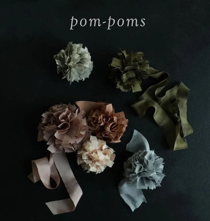
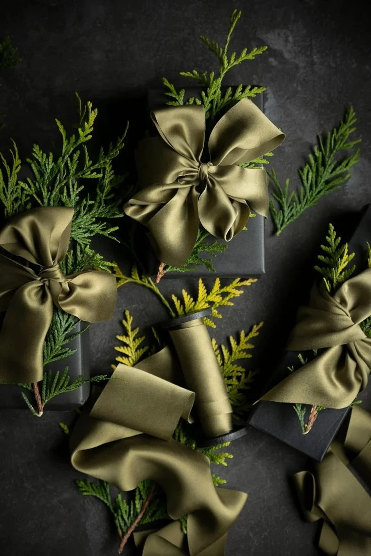
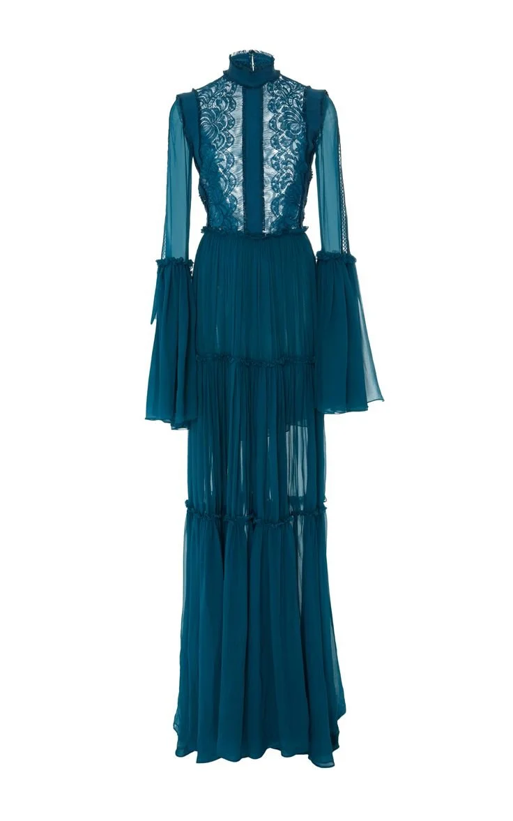
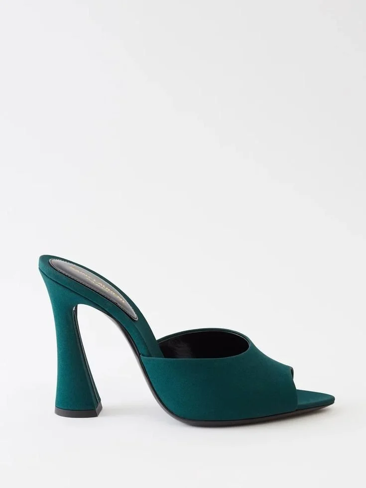
5. Teal & Olive

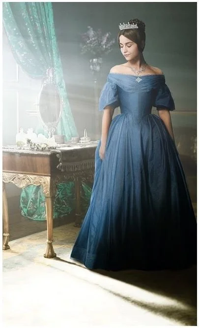
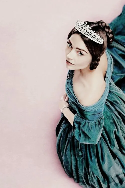
My undying love for teal & olive is well documented (see the Victoria Series entry for gorgeous proof). I first fell for this unanticipated color palette while watching the 2014 version of Madame Bovary, in a fleeting moment when Mia Wasikowska’s character wears an olive cape and bonnet atop a teal silk gown. The moment was brief, but the colors were arresting, so utterly unexpected. When it comes to creative projects, it’s generally something quite small that unlocks the flow state; it was this onscreen moment— along with those of another historical costume drama, Victoria— which inspired my family and I as we renovated an historic estate home in beguiling shades of blue, green, and teal.


Photos, from top left to bottom right: First Row: Dress This Way, Silk & Willow, Pinterest, Milla, Second Row: Caroline Constas, Doctor Who, Costarellos, Happy Buddha Breathing, Third Row: Pinterest, Mary Frances, Handwritten by Lee, Milla, Fourth Row: Wed Luxe, Burberry, Wed Luxe, KT Merry via Style Me Pretty, Fifth Row: Saint Laurent, Frock Flicks, Etsy, Hypatian, Sixth Row: Les Anagnou, Pinterest, House of Hackney, Andrew Gn.
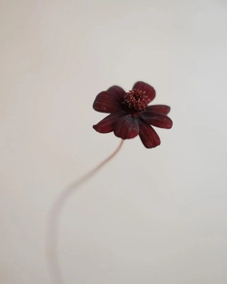
A deeply jeweled palette of teal & olive more surprising than the jewel tones we have, in wedding and floral design, come to expect. Teal lends itself to a wedding’s fine fabrics, including table linens, silk ribbon, and, of course, wedding party gowns. To incorporate olive, turn to fruiting olive branches and Silk & Willow silk satin ribbon in an olive hue “achieved through a careful hand-dying process using the hand-picked marigold flowers we gather from our gardens all summer.” For added richness, incorporate chocolate browns, include the mocha-colored chocolate cosmos, a flower whose fragrance is as sublime as its name implies.


The palette perfectly represented in a collection, Andrew Gn’s Fall 2021 Ready-to-Wear, images via Vogue. Olive adornments— a brooch detail at the waist, the beadwork on a pair of boots— are flawless with teal blue-ish greens. And note how beautifully chocolate works with both colors.